发现变弯真是个好的点子!!!
最近发现一个好玩的图形,可以展现不同分组的数据分布规律。其实图形展示可能不够一目了然,但是颜值还是挺高的。画图就是以“颜值”为目标。毕竟现在想搞一些好的文章,不仅实验设计好,分析厉害,对结果展示也要求一些高逼格的图表展示。
圆波图是我自己随便命名的,反正图形是圆形,数据是波浪形的,简称圆波图。完美!
其实我们一般在展现不同分组的数据分布的时候,常用的是柱形图,箱线图,或者小提琴图,或者更高级一点的云雨图。类似于下图。
我们利用R包ggridges自带的数据lincoln_weather来进行数据展示。这也就意味这首先你得先按照今天的主角R包ggridges,才能开始。
#R4.0.2 win10
#install packages firstly
#install.pcakages("ggridges","pacman")随后看看我们如何利用lincoln_weather数据玩出什么好看的图形吧。首先lincoln_weather数据我们只需要温度和月份两列数据。然后再次基础上绘制散点图,箱线图,小提琴图,以及线条图。
# start code with installed packages firstly
pacman::p_load('ggridges','tidyverse','patchwork')

# the data tidy form the R packages
dat_plot = lincoln_weather %>%
  select(Temp = `Mean Temperature [F]`,Mon = Month)
dat_plot$Mon = factor(dat_plot$Mon, levels = unique(dat_plot$Mon))

# the four plot to display

color = c("#000e42", "#00499b", "#709dd4", "#af585e", "#ff4e00", "#397168", "#2aa644", "#5ca9b9", "#a4c2de", "#6be2aa","#f26cb0","#fb9754")

# the boxplot
ggplot(data = dat_plot, aes(x = Temp, y = Mon, color = Mon)) +
  geom_boxplot(size = 1,width = 0.5,notch = TRUE,outlier.color = "black") +
  scale_color_manual(values = color)+
  theme_classic() -> p1
# the point plot
ggplot(data = dat_plot, aes(x = Temp, y = Mon, color = Mon)) +
  geom_point(size = 1.5) +
  scale_color_manual(values = color)+
  theme_classic() -> p2
# the violin plot
ggplot(data = dat_plot, aes(x = Temp, y = Mon, color = Mon, fill = Mon)) +
  geom_violin(size = 1,width = 0.5,draw_quantiles = c(0.25, 0.5, 0.75)) +
  scale_color_manual(values = color)+
  scale_fill_manual(values = color)+
  theme_classic() -> p3
# the pointrange plot
dat_plot %>%
  group_by(Mon) %>%
  summarise(avg = mean(Temp), big = max(Temp), sma = min(Temp)) %>%
  ggplot(aes(x = avg, y = Mon, color = Mon, fill = Mon))+
  geom_pointrange(aes(xmin = sma, xmax = big),size = 1)+
  scale_color_manual(values = color)+
  scale_fill_manual(values = color)+
  theme_classic() -> p4
## `summarise()` ungrouping output (override with `.groups` argument)# merge plots
patchwork <- p1+p2+p3+p4+plot_annotation(tag_levels = 'A')
print(patchwork&labs(x = "Mean Temperature [F]",y = "Month",color = "Month",fill = "Month"))## notch went outside hinges. Try setting notch=FALSE.## notch went outside hinges. Try setting notch=FALSE.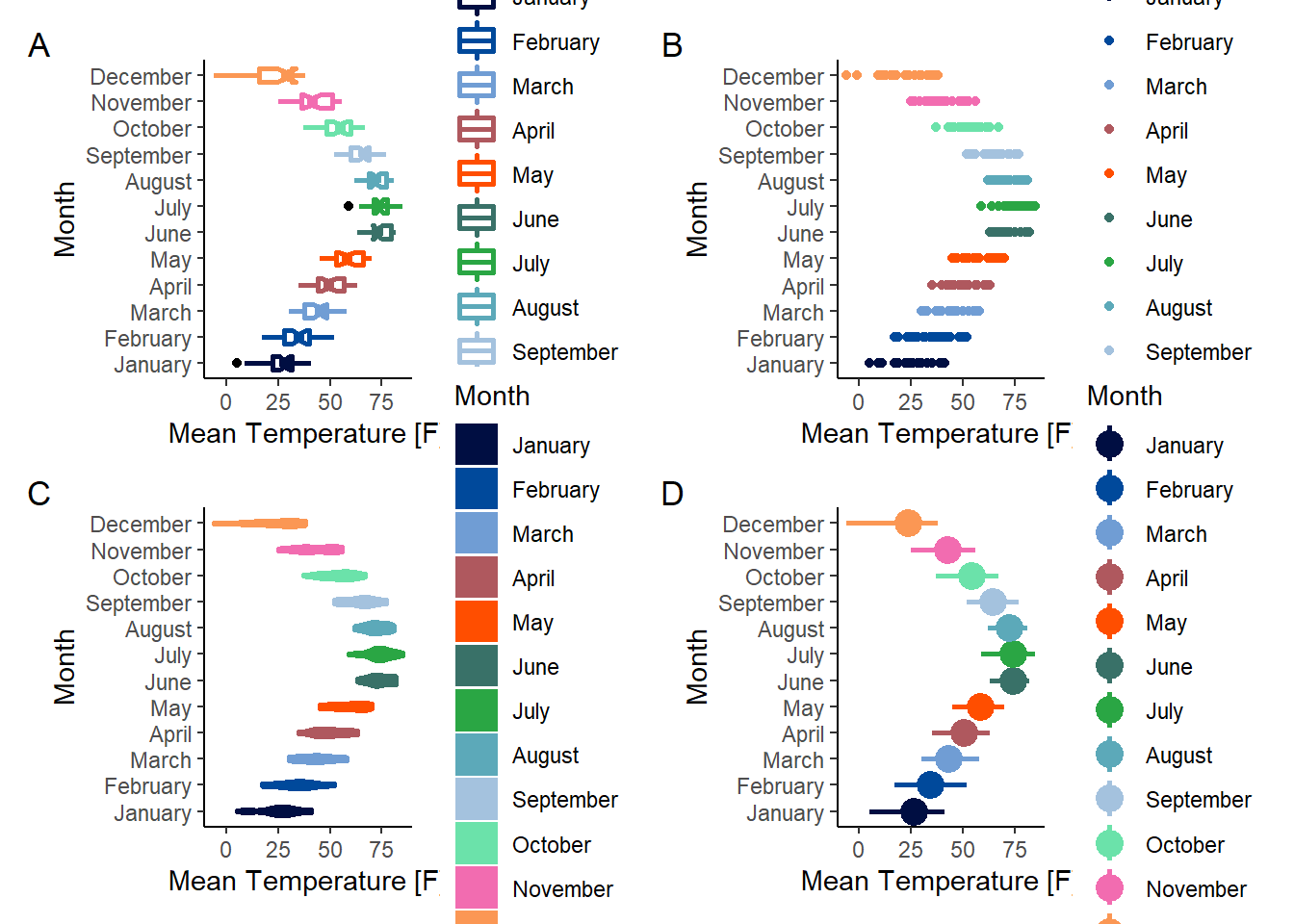
其实以上图形的展示效果都挺好的,但是如果墨守成规,那就未免太无聊点了。正好我有一个客户想要展示的是24h内的基因功能变化。但是提供的是一篇《CELL》文章的例图,原本想法是重现文中的图形,画了半个小时左右,顺利实现了。但是第二天突然想到一个点子。展示的图形也许可以玩的更骚一点。
数据就不再用生物学的概念了。还是用上面用到的天气数据。看看可不可以弄的更有意思些。
#the ridges plot
ggplot(data = dat_plot, aes(x = Temp, y = Mon, fill = Mon, color = Mon)) +
geom_density_ridges(
alpha = 0.9,
bandwidth = 3,
scale = 1,
rel_min_height = 0.01) +
scale_color_manual(values = color)+
scale_fill_manual(values = color)+
theme_classic() -> p5
# raincloud plot
ggplot(data = dat_plot, aes(x = Temp, y = Mon, color = Mon, fill = Mon)) +
geom_density_ridges(
jittered_points = TRUE,
position = "raincloud",
alpha = 0.7,
scale = 0.5,
bandwidth =3,
rel_min_height = 0.01
) +
scale_color_manual(values = color)+
scale_fill_manual(values = color)+
theme_classic() -> p6
patchwork <- p5+p6+plot_annotation(tag_levels = 'A')
print(patchwork&labs(x = "Mean Temperature [F]",y = "Month",color = "Month",fill = "Month"))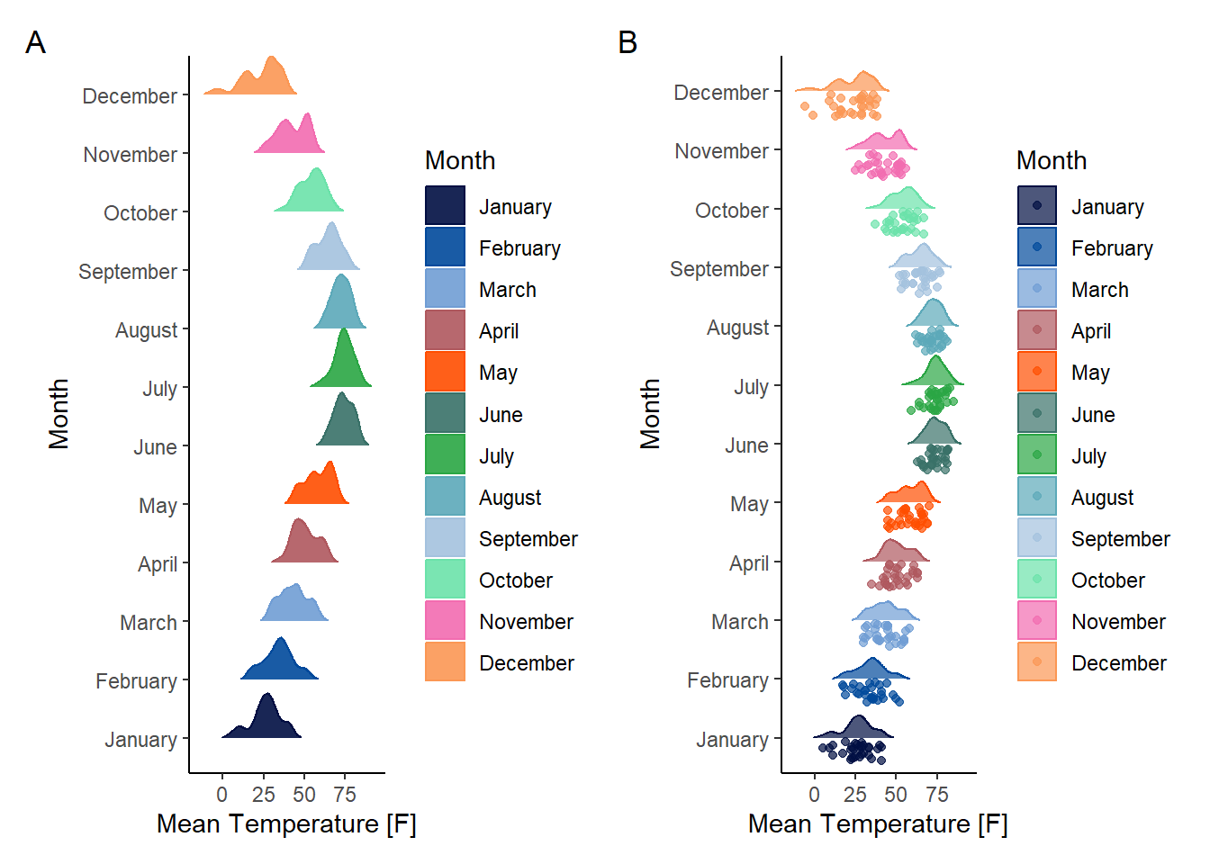 以上图形分别是山脉图和云雨图,但是还不够骚气。为什么呢,因为最开始我想展现的是24h一个周期内的变化。而我之所以选择气温的数据,原因也在于一年十二个月是周期性变化的。所以我们能不能同时展现这样一个周期的变化呢。这样一想,我们就可以通过
coord_ploar将图形掰弯。
# set theme for circ plot
theme_circ <- function(){
  theme_minimal() %+replace%
  theme(axis.text.y = element_blank(),
        axis.ticks.y = element_blank(),
        axis.text.x=element_text(size=10,face="bold"),
        legend.text=element_text(size=8),
        legend.title = element_text(size=10,face="bold"),
        legend.position = "none")
}
# plot
p7 <- p5+coord_polar(theta = "x")+theme_circ()
p8 <- p6+coord_polar(theta = "x")+theme_circ()
patchwork <- p7+p8+plot_annotation(tag_levels = 'A')
print(patchwork&labs(x = " ",y = " ",color = "Month",fill = "Month",x = " ",y = " "))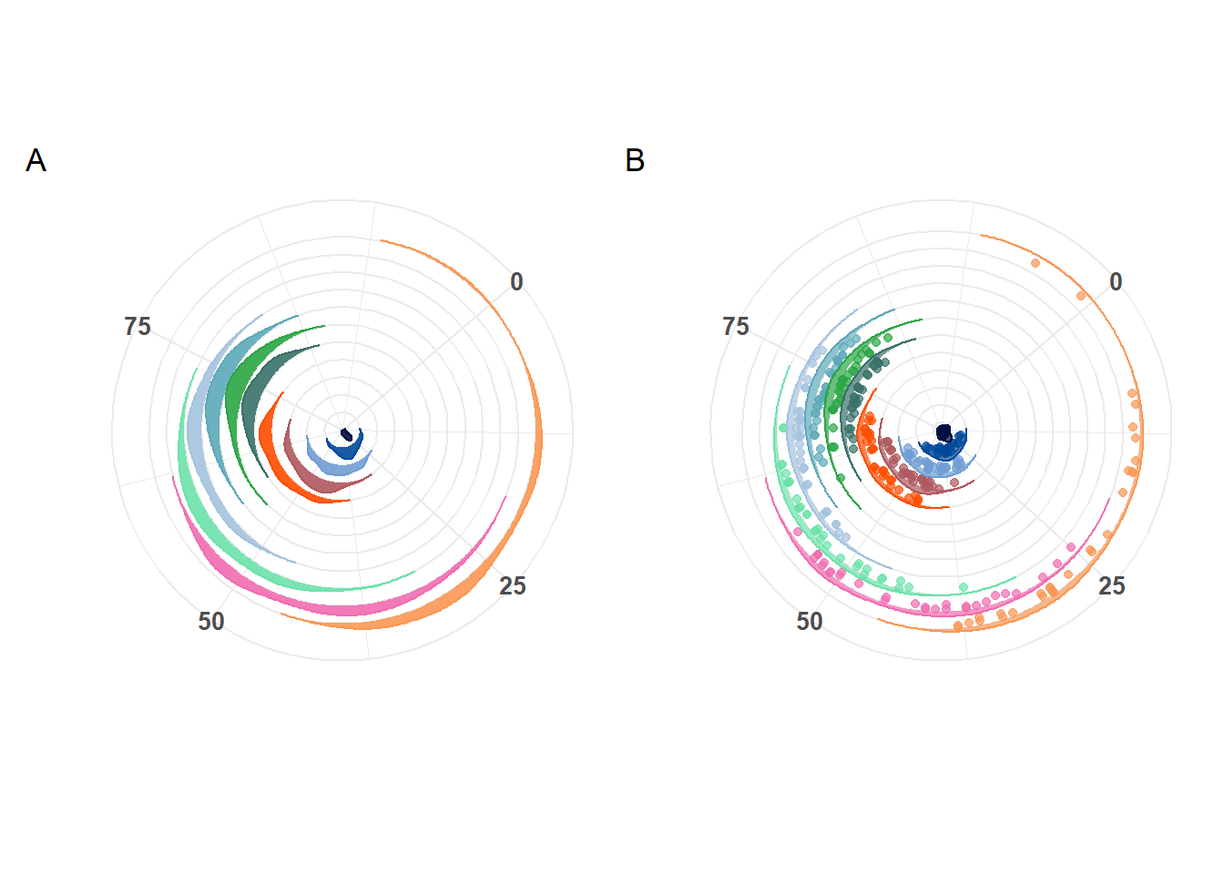
当然了,实际作图的时候,肯定是比这些更精雕细琢一些,但是作为使用的方案,基本都和上面差不多。完结撒花!