地图可视化展示新冠全球流行
寻找数据
最开始在二月份的时候,新冠主要是在国内疯狂传播,所以当时基本上的数据都是主要来自丁香园的网站。当时有个非常火的Github项目,就是用python爬取丁香园的网站数据。当时还在放假,所以我还是抱着极大的兴趣,去学习了那个项目,最后也是成功的爬取了新冠肺炎的传播和感染数据,并将储蓄在本地。
但是其实,那个项目的脚本,我只能说我懂70%,剩下的30%真的是有点难以入手。而且我不会python的数据处理,字典格式的数据对我来说太过于痛苦,所以后面自己就老老实实买了个python的教材,看了一半。觉得有所收获(半瓶晃荡),就去按照自己的想法写了个爬虫,把xx网站给爬了。但也仅限于此,后面python就荒废了。我又跑去学习制作R包了,因为我有很多脚本,一直缺乏系统的整理。所以就想边学习R包,边整理下。
但是心里一直想找个机会用R来展现下全球的新冠肺炎病毒的情况。直到有一次看到了一个网站收录了新冠肺炎的数据。就像乘着有现成的数据做下新冠感染地图的可视化。
画图构思
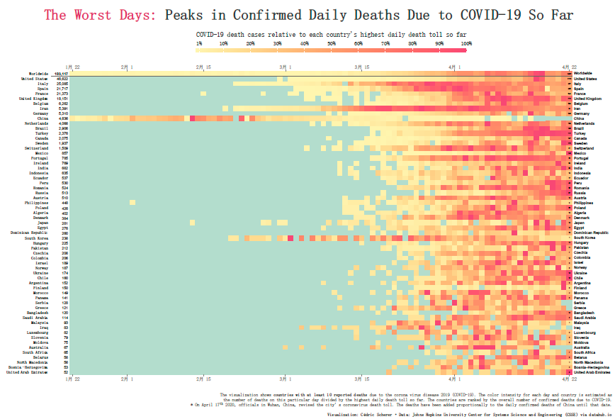
最开始我的想法是画热图,根据大神的脚本,自己去做下修改,参考的图形如下,自己照葫芦画瓢,确实也画了出来,但是效果我觉得不好。原因在于,根本看不清具体情况。
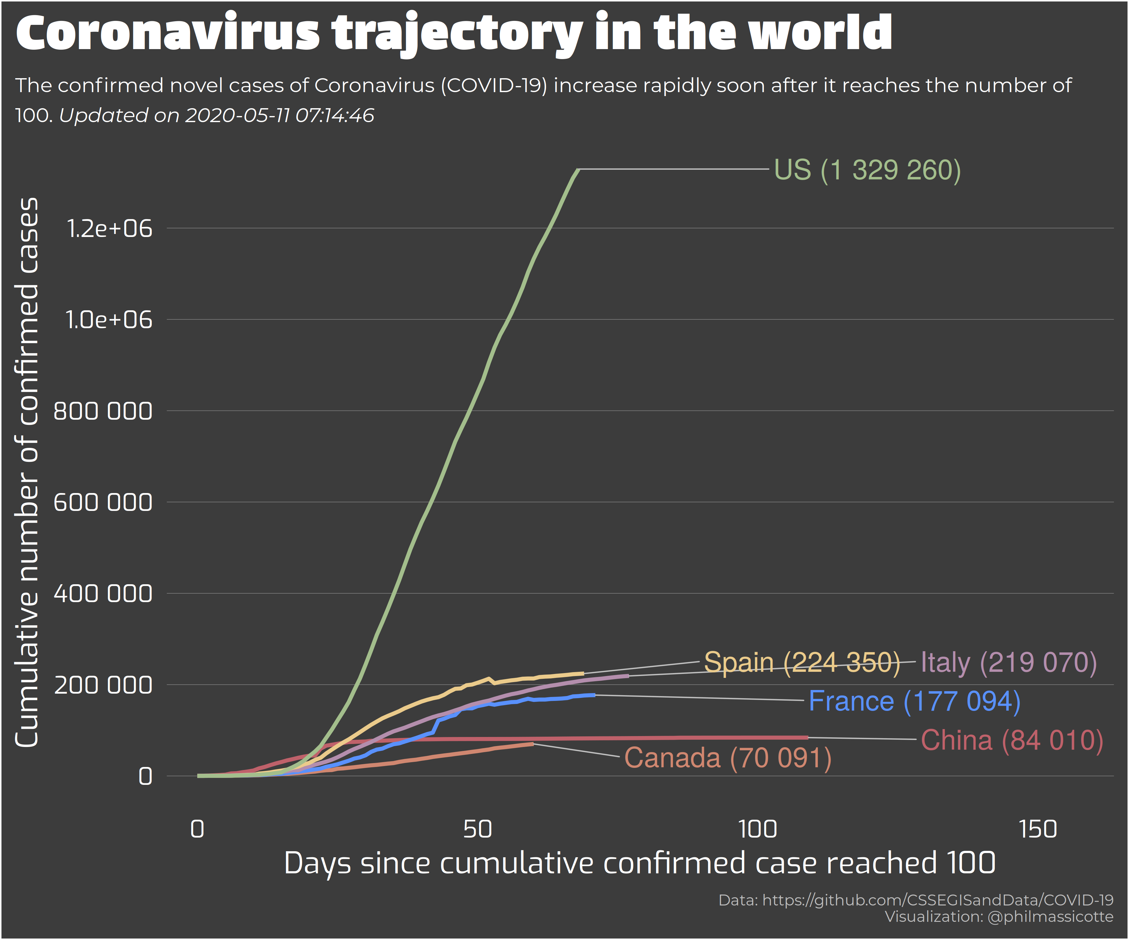
所以我就想画一个折线图,去展现全球各个国家感染人数的变化规律。但是这个好像没啥创意!画折线图的挑战不够,没啥意思。柱形图就更别说了!
后面觉得还是用地图去展示国家的信息,用颜色来反馈新冠病毒传播。会比较好,就像下图一样

但是后面对脚本修修改改,觉得可以参考很早以前,看的一个图,用它的字体来进行展现,效果可能会更好。字体效果如下图。然后就用showtext来做到了这个效果。
为了字体画了很多时间,不断试错,找教程,画图的一半精力都是放在字体的修改上的。但是收获是肯定很大的。
最终我的脚本画出来的效果如下,我个人在美观上,我给自己打满分,但是是在展现信息的程度,我觉得可能是不及格的,第一颜色区分度不够,这个我尝试了很久,没有好的解决办法,除非花费大量精力,去摸索log处理的可视化。不想做,我太懒了。还有就是我应该加个时间刻度,但是我没精力去做这个了。下次有机会做其他图,再摸索这个。

脚本如下,有兴趣的可以尝试下:
#==============================
#----王二狗Abego----------------
#----2020-05-14----------------
#----申明:地图本身有很强的ZZ性,我肯定爱国小青年,但是部分地区确实单独统计人数,并且在地图上也有自己的领域。所以只能捏着鼻子承认地图的名字,脚本中也做了备注。一句话,此生无悔入种花,来生还做种花人。-----
#==============================

#=======R packages require=====
library(tidyverse)
library(showtext)
library(ggtext)
library(rworldmap)
library(sf)
library(lubridate)
#==============================

rm(list = ls())
font_paths(here::here("font"))
font_add(family = "YouMurdererBB", regular = "youmurdererbb_reg.ttf")
font_add("heiti", "simhei.ttf")

theme_set(theme_minimal())
theme_update(
  axis.ticks = element_blank(),
  axis.text = element_blank(),
  panel.grid.major = element_line(color = "#fbf7f8",
                                  size = 0.5),
  panel.background = element_rect(color = NA,
                                  fill = "#fbf7f8"),
  plot.background = element_rect(color = NA,
                                 fill = "#fbf7f8"),
  plot.title = element_text(family = "YouMurdererBB",
                            color = "dark red",
                            size = 350,
                            hjust = 0.5,
                            margin = margin(t = 24, b = 6)),
  plot.subtitle = element_text(family = "YouMurdererBB",
                               color = "dark red",
                               size = 200,
                               hjust = 0.5,
                               margin = margin(t = 0, b = 0)),
  plot.caption = element_text(family = "heiti",
                              color = "dark red",
                              size = 50,
                              margin = margin(t = 0, b = 24)),
  legend.position = "top",
  legend.text = element_text(family = "YouMurdererBB",
                             color = "dark red",
                             size = 150),
  legend.key.width = unit(5.2, "lines"),
  legend.key.height = unit(0.8, "lines")
)

#=======reshape data=========================

df_corona <- readr::read_csv("https://datahub.io/core/covid-19/r/time-series-19-covid-combined.csv")

# Notice:fix april 17, China adjust death people number in wuhan beacuse the satistical error with the medical resource pressure.

df_corona_days <-
  df_corona %>%
  dplyr::select(
    date = Date,
    country = `Country/Region`,
    state = `Province/State`,
    lat = Lat,
    lng = Long,
    infect = Confirmed,
  ) %>%
  mutate(infect = if_else(infect <= 0, NA_real_, infect)) %>%
  group_by(country, date) %>%
  summarize(
    infections = sum(infect, na.rm = T),
    lat = first(lat),
    lng = first(lng)
  ) %>%
  mutate(
    yday = yday(date),
    day = day(date),
    month = month(date, label = T)
  ) %>%
  ungroup() %>%
  arrange(country, yday) %>%
  mutate(
    country = case_when(
      country == "Tanzania" ~      "United Republic of Tanzania",
      country == "Congo (Brazzaville)" ~            "Republic of the Congo",
      country == "Holy See" ~                          "Vatican",
      country == "Guinea-Bissau" ~                    "Guinea Bissau",
      country == "North Macedonia" ~                        "Macedonia",
      country == "Taiwan*" ~                           "Taiwan",
      country == "West Bank and Gaza" ~                        "Palestine",
      country == "Timor-Leste" ~                       "East Timor",
      country == "Cabo Verde" ~                       "Cape Verde",
      country == "US" ~         "United States of America",
      country == "Eswatini" ~                        "Swaziland",
      country == "Korea, South" ~                      "South Korea",
      country == "Czechia" ~                   "Czech Republic",
      country == "Serbia" ~               "Republic of Serbia",
      country == "Cote d'Ivoire" ~                      "Ivory Coast",
      country == "Congo (Kinshasa)" ~ "Democratic Republic of the Congo",
      country == "Burma" ~                          "Myanmar",
      TRUE ~ country
    ),
    country = str_replace(country, " and ", " & "),
    country = str_replace(country, "-", " ")
  )
# I didn't confirm taiwan or hongkong, Macao is a country but they count the ncov confirm peoplr number separatily, beside then they have the region in rworldmap. SO I HAVEM'T TO PLOT THIS ALONELY, ONE CHINA, ONE COUNTRY.

first_day <- min(df_corona_days$yday)
latest_day <- max(df_corona_days$yday)
n_countries <- n_distinct(df_corona_days$country)
max_infect_num <- max(df_corona_days$infections)
redgreen = colorRampPalette(c("#d66c78", "#071582","#4a040c"))(1000)
#=============map data perparation=============================
sf_world <- st_as_sf(rworldmap::getMap(resolution = "low")) %>%
  st_transform(crs = "+proj=robin")

showtext_auto()


for(i in first_day:latest_day) {
  print(i)

  df_corona_day <-
    df_corona_days %>%
    filter(yday == i)

  sf_world_borders <-
    sf_world %>%
    left_join(df_corona_day, by = c("SOVEREIGNT" = "country"))
  # the ship MS Zaandam and Diamond Princess isn't see as a country in rworldmap

  p <-
    ggplot(sf_world_borders) +
    geom_sf(aes(fill = infections),
            color = "#f2eae8",
            alpha = 0.75,
            size = 0.3) +
    scale_x_continuous(breaks = seq(-180, 180, by = 30)) +
    scale_y_continuous(breaks = c(seq(-80, 80, by = 20), 85)) +
    scale_fill_gradientn(colours = redgreen,
                         na.value = "#badad0",
                         limits = c(0, max_infect_num),
                         guide = F,
                         name = NULL,
                         breaks= scales::pretty_breaks()) +
    guides(fill = guide_legend(title.position = "top",
                               title.hjust = 0.5,
                               nrow = 1,
                               label.position = "top")) +
    labs(x = NULL, y = NULL,
         title = "Number of nCov-2019 Infections",
         subtitle = "Terrible, Highly Infectious Virus",
         caption = "Visualization by 王二狗 2020-05-15")
  #为了动图,所以每一天都生成了图,后续用magick做动图
  ggsave(here::here("plots", "rworldmap",
                    glue::glue("corona_sum_yday_{sprintf('%03d', i)}.png")),
         plot = p,
         width = 18, height = 11.74, device = "png", type = "cairo")
}