用于R图形的BBC视觉和数据新闻手册
如何创建BBC风格的图形
在BBC数据团队,我们开发了一个R包和一个R菜谱,使用R的ggplot2库,以我们的内部风格创建出版就绪图形的过程,这是一个更可重复的过程,并使新手更容易到R来创建图形。
下面的食谱应该有希望帮助任何想要制作这样的图形的人:
我们将了解如何将这些图形的各种元素组合在一起,但让我们首先让管理员远离…
加载您需要的所有库
本手册中的一些步骤 - 以及通常在R中创建图表 - 需要安装和加载某些软件包。因此,您不必逐个安装和加载它们,您可以使用包中的p_load函数使用pacman以下代码一次性加载它们。
#用pacman中的加载函数,其实我也不知道这个比library好到哪里去了
if(!require(pacman))install.packages("pacman")
pacman::p_load('dplyr', 'tidyr', 'gapminder', 'ggplot2',  'ggalt', 'forcats', 'R.utils', 'png', 'grid', 'ggpubr', 'scales','bbplot')
安装bbplot包
bbplot不在CRAN上,所以你必须直接从Github安装它devtools。
如果您没有devtools安装软件包,则还必须在下面的代码中运行第一行。
# install.packages('devtools')
devtools::install_github('bbc/bbplot')
有关bbplot查看软件包的Github存储库的更多信息,但有关如何使用软件包及其功能的大部分详细信息详述如下。
下载软件包并成功安装后,您可以创建图表。
bbplot包如何工作?
该软件包有两个功能,bbc_style()和finalise_plot()。
bbc_style():没有参数,并在创建绘图后添加到ggplot’链’。它的作用通常是将文本大小,字体和颜色,轴线,轴文本,边距和许多其他标准图表组件转换为BBC样式,这是根据设计团队的建议和反馈制定的。
请注意,折线图中的线条颜色或条形图条形图的颜色不是从bbc_style()函数中开箱即用的,而是需要在其他标准ggplot图表函数中明确设置。
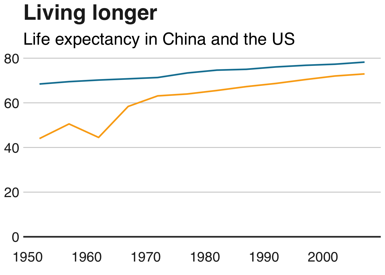
下面的代码显示了如何bbc_style()在标准图表生成工作流程中使用它。这是一个非常简单的折线图的示例,使用gapminder包中的数据。
#Data for chart from gapminder package
line_df <- gapminder %>%
  filter(country == "Malawi")

#Make plot
line <- ggplot(line_df, aes(x = year, y = lifeExp)) +
  geom_line(colour = "#1380A1", size = 1) +
  geom_hline(yintercept = 0, size = 1, colour="#333333") +
  bbc_style() +
  labs(title="Living longer",
       subtitle = "Life expectancy in Malawi 1952-2007")
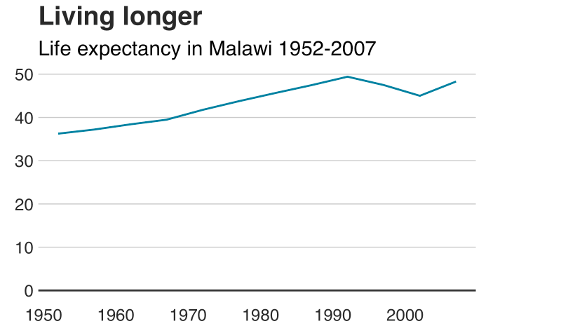
这是bbc_style()功能实际上在幕后做的事情。它实质上修改了theme函数中的某些参数ggplot2。
例如,第一个参数是设置绘图的title元素的字体,大小,字体和颜色。
## function ()
## {
##     font <- "Helvetica"
##     ggplot2::theme(plot.title = ggplot2::element_text(family = font,
##         size = 28, face = "bold", color = "#222222"), plot.subtitle = ggplot2::element_text(family = font,
##         size = 22, margin = ggplot2::margin(9, 0, 9, 0)), plot.caption = ggplot2::element_blank(),
##         legend.position = "top", legend.text.align = 0, legend.background = ggplot2::element_blank(),
##         legend.title = ggplot2::element_blank(), legend.key = ggplot2::element_blank(),
##         legend.text = ggplot2::element_text(family = font, size = 18,
##             color = "#222222"), axis.title = ggplot2::element_blank(),
##         axis.text = ggplot2::element_text(family = font, size = 18,
##             color = "#222222"), axis.text.x = ggplot2::element_text(margin = ggplot2::margin(5,
##             b = 10)), axis.ticks = ggplot2::element_blank(),
##         axis.line = ggplot2::element_blank(), panel.grid.minor = ggplot2::element_blank(),
##         panel.grid.major.y = ggplot2::element_line(color = "#cbcbcb"),
##         panel.grid.major.x = ggplot2::element_blank(), panel.background = ggplot2::element_blank(),
##         strip.background = ggplot2::element_rect(fill = "white"),
##         strip.text = ggplot2::element_text(size = 22, hjust = 0))
## }
## <environment: namespace:bbplot>
您可以通过调用theme具有所需参数的函数来修改图表的这些设置,或添加其他主题参数- 但请注意,要使其工作,您必须在调用bbc_style函数后调用它。否则bbc_style()将覆盖它。
这将通过向bbc_style()函数中包含的内容添加额外的主题参数来添加一些网格线。整本食谱中有许多类似的例子。
theme(panel.grid.major.x = element_line(color="#cbcbcb"),
        panel.grid.major.y=element_blank())
保存完成的图表
将bbc_style()图表添加到图表后,还有一个步骤可以让您的图表准备好发布。finalise_plot(),bbplot包的第二个功能,将左对齐标题,副标题,并在图的右下角添加一个源和一个图像的页脚。它还会将其保存到您指定的位置。该函数有五个参数:
以下是函数参数: finalise_plot(plot_name, source, save_filepath, width_pixels = 640, height_pixels = 450)
plot_name:你已经叫你的情节,比如图表实例变量名以上plot_name会"line"source:要显示在绘图左下角的源文本。您需要"Source:"在它之前键入单词,因此例如source = "Source: ONS"是正确的方法。save_filepath:您希望图形保存到的精确文件路径,包括最后的.png扩展名。这取决于您的工作目录以及您是否在特定的R项目中。一个示例文件路径是:Desktop/R_projects/charts/line_chart.png。width_pixels:默认情况下,此值设置为640px,因此,如果希望图表具有不同的宽度,请仅调用此参数,并指定所需的宽度。height_pixels:默认情况下,此值设置为450px,因此,如果希望图表具有不同的高度,请仅调用此参数,并指定所需的值。logo_image_path:此参数指定图表右下角的图像/徽标的路径。默认情况下,占位符PNG文件的背景与绘图的背景颜色相匹配,因此如果您希望它显示没有徽标,请不要指定参数。如果要添加自己的徽标,只需指定PNG文件的路径即可。该包装的编写考虑了广泛而薄的图像。
finalise_plot()在标准工作流程中如何使用的示例。一旦您创建并最终确定了图表数据,标题并添加了该函数,就会调用此函数bbc_style():
finalise_plot(plot_name = my_line_plot,
              source = "Source: Gapminder",
              save_filepath = "filename_that_my_plot_should_be_saved_to.png",
              width_pixels = 640,
              height_pixels = 450,
              logo_image_path = "placeholder.png")
因此,一旦你创建了你的情节并且相对满意它,你可以使用该finalise_plot()函数进行最后的调整并保存你的图表,以便你可以在RStudio之外查看它。
值得一提的是,在早期这样做是个好主意,因为文本和其他元素的位置无法在RStudio Plots面板中准确呈现,因为这取决于您希望绘图的大小和宽高比,因此保存它并打开文件可以准确地表示图形的外观。
finalise_plot()函数不仅可以保存您的图表,还可以左对齐标题和副标题,这是BBC图形的标准,在右侧添加带有徽标的页脚,并允许您在左侧输入源文本。
那么如何保存上面创建的示例图?
finalise_plot(plot_name = line,
              source = "Source: Gapminder",
              save_filepath = "images/line_plot_finalised_test.png",
              width_pixels = 640,
              height_pixels = 550)
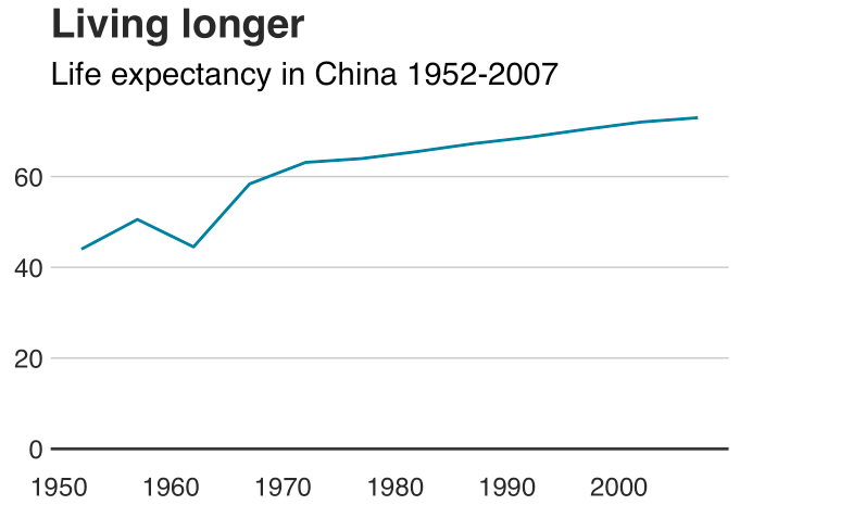
制作折线图
#Prepare data
line_df <- gapminder %>%
  filter(country == "China")

#Make plot
line <- ggplot(line_df, aes(x = year, y = lifeExp)) +
  geom_line(colour = "#1380A1", size = 1) +
  geom_hline(yintercept = 0, size = 1, colour="#333333") +
  bbc_style() +
  labs(title="Living longer",
       subtitle = "Life expectancy in China 1952-2007")
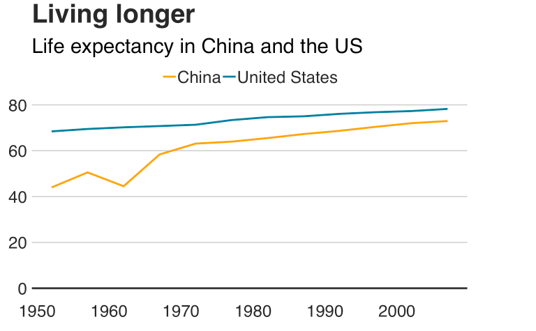
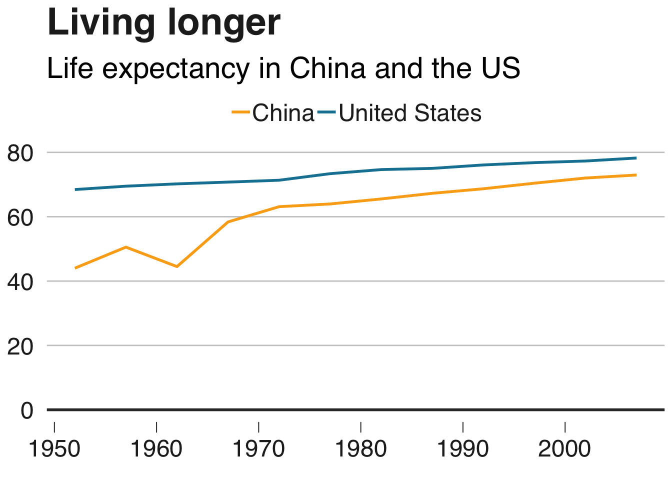
制作一个多线图
#Prepare data
multiple_line_df <- gapminder %>%
  filter(country == "China" | country == "United States")

#Make plot
multiple_line <- ggplot(multiple_line_df, aes(x = year, y = lifeExp, colour = country)) +
  geom_line(size = 1) +
  geom_hline(yintercept = 0, size = 1, colour="#333333") +
  scale_colour_manual(values = c("#FAAB18", "#1380A1")) +
  bbc_style() +
  labs(title="Living longer",
       subtitle = "Life expectancy in China and the US")
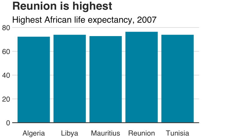
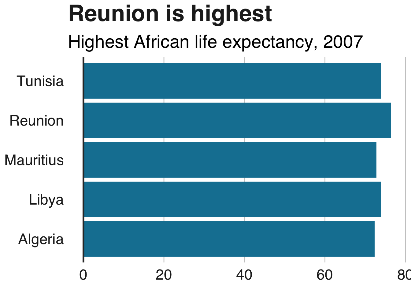
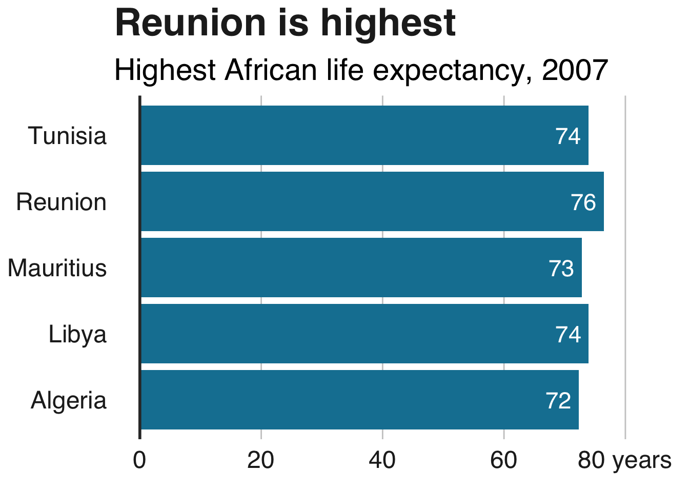
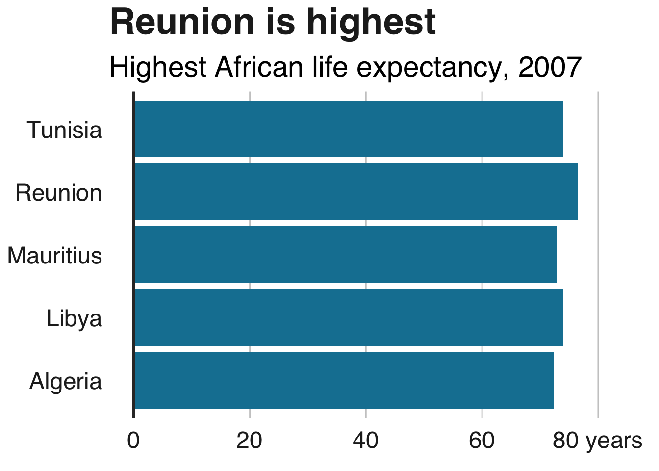
制作条形图
#Prepare data
bar_df <- gapminder %>%
filter(year == 2007 & continent == "Africa") %>%
arrange(desc(lifeExp)) %>%
head(5)
#Make plot
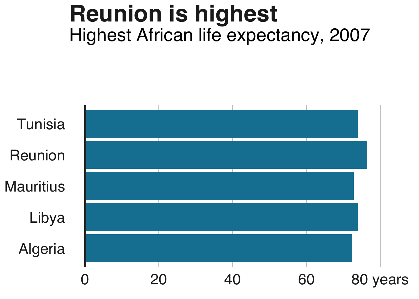
bars <- ggplot(bar_df, aes(x = country, y = lifeExp)) +
geom_bar(stat="identity",
position="identity",
fill="#1380A1") +
geom_hline(yintercept = 0, size = 1, colour="#333333") +
bbc_style() +
labs(title="Reunion is highest",
subtitle = "Highest African life expectancy, 2007")
制作堆积条形图
#prepare data
stacked_df <- gapminder %>%
  filter(year == 2007) %>%
  mutate(lifeExpGrouped = cut(lifeExp,
                    breaks = c(0, 50, 65, 80, 90),
                    labels = c("Under 50", "50-65", "65-80", "80+"))) %>%
  group_by(continent, lifeExpGrouped) %>%
  summarise(continentPop = sum(as.numeric(pop)))

#set order of stacks by changing factor levels
stacked_df$lifeExpGrouped = factor(stacked_df$lifeExpGrouped, levels = rev(levels(stacked_df$lifeExpGrouped)))

#create plot
stacked_bars <- ggplot(data = stacked_df,
                       aes(x = continent,
                           y = continentPop,
                           fill = lifeExpGrouped)) +
  geom_bar(stat = "identity",
           position = "fill") +
  bbc_style() +
  scale_y_continuous(labels = scales::percent) +
  scale_fill_viridis_d(direction = -1) +
  geom_hline(yintercept = 0, size = 1, colour = "#333333") +
  labs(title = "How life expectancy varies",
       subtitle = "% of population by life expectancy band, 2007") +
  theme(legend.position = "top",
        legend.justification = "left") +
  guides(fill = guide_legend(reverse = TRUE))
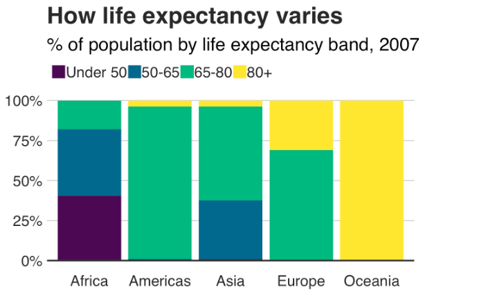
此示例显示了比例,但您可能希望制作显示数字值的堆积条形图 - 这很容易更改!
传递给position参数的值将确定堆积图表是显示比例还是实际值。
position = "fill"将按比例绘制堆栈,并position = "identity"绘制数值。
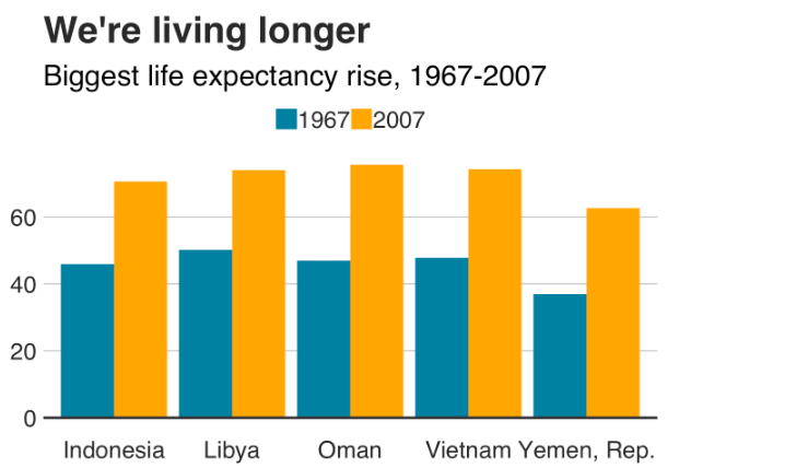
制作分组条形图
制作分组条形图与制作条形图非常相似。
你只需要改变position = "identity"对position = "dodge",并设置fill美观,而不是:
#Prepare data
grouped_bar_df <- gapminder %>%
  filter(year == 1967 | year == 2007) %>%
  select(country, year, lifeExp) %>%
  spread(year, lifeExp) %>%
  mutate(gap = `2007` - `1967`) %>%
  arrange(desc(gap)) %>%
  head(5) %>%
  gather(key = year,
         value = lifeExp,
         -country,
         -gap)

#Make plot
grouped_bars <- ggplot(grouped_bar_df,
                       aes(x = country,
                           y = lifeExp,
                           fill = as.factor(year))) +
  geom_bar(stat="identity", position="dodge") +
  geom_hline(yintercept = 0, size = 1, colour="#333333") +
  bbc_style() +
  scale_fill_manual(values = c("#1380A1", "#FAAB18")) +
  labs(title="We're living longer",
       subtitle = "Biggest life expectancy rise, 1967-2007")
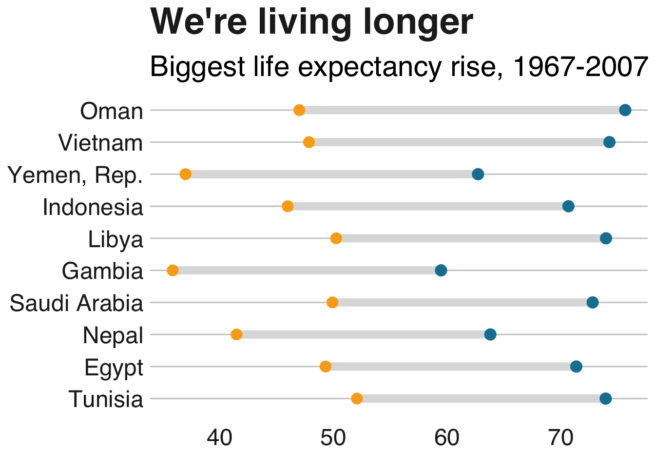
制作哑铃图
另一种显示差异的方法是哑铃图:
library("ggalt")
library("tidyr")

#Prepare data
dumbbell_df <- gapminder %>%
  filter(year == 1967 | year == 2007) %>%
  select(country, year, lifeExp) %>%
  spread(year, lifeExp) %>%
  mutate(gap = `2007` - `1967`) %>%
  arrange(desc(gap)) %>%
  head(10)

#Make plot
ggplot(dumbbell_df, aes(x = `1967`, xend = `2007`, y = reorder(country, gap), group = country)) +
  geom_dumbbell(colour = "#dddddd",
                size = 3,
                colour_x = "#FAAB18",
                colour_xend = "#1380A1") +
  bbc_style() +
  labs(title="We're living longer",
       subtitle="Biggest life expectancy rise, 1967-2007")
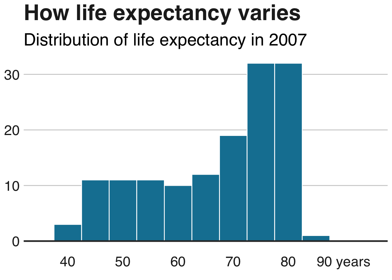
制作直方图
hist_df <- gapminder %>%
  filter(year == 2007)

ggplot(hist_df, aes(lifeExp)) +
  geom_histogram(binwidth = 5, colour = "white", fill = "#1380A1") +
  geom_hline(yintercept = 0, size = 1, colour="#333333") +
  bbc_style() +
  scale_x_continuous(limits = c(35, 95),
                     breaks = seq(40, 90, by = 10),
                     labels = c("40", "50", "60", "70", "80", "90 years")) +
  labs(title = "How life expectancy varies",
       subtitle = "Distribution of life expectancy in 2007")
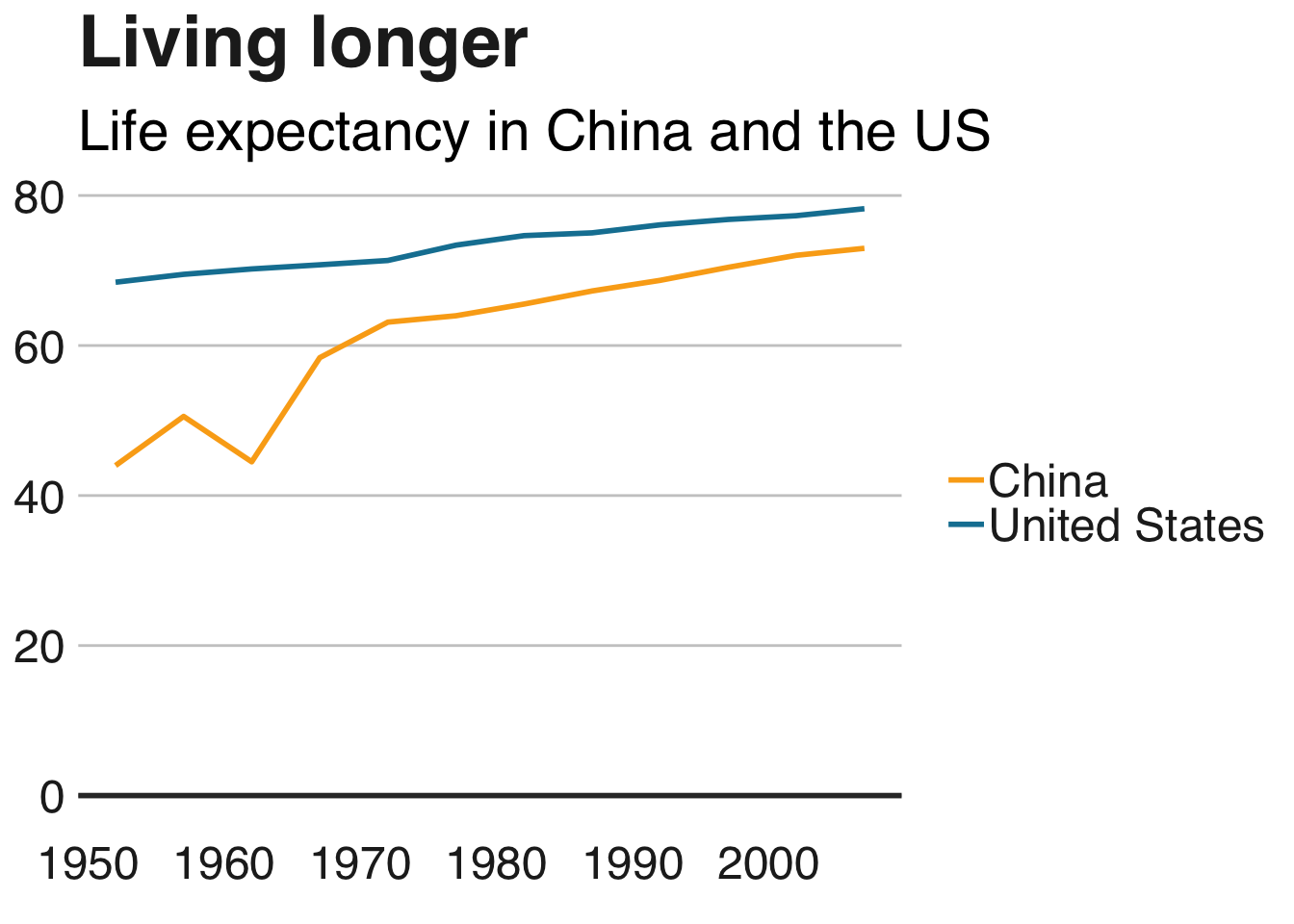
更改图例
删除图例
删除图例成为一个 - 最好使用文本注释直接标记数据。
使用guides(colour=FALSE)去除传说特定的审美(更换colour有关美学)。
multiple_line + guides(colour=FALSE)
您还可以使用theme(legend.position = "none")以下方式一次性删除所有图例:
multiple_line + theme(legend.position = "none")
更改图例的位置
图例的默认位置位于图表的顶部。将其移动到图表外部的左侧,右侧或底部:
multiple_line + theme(legend.position = "right")
要确切地了解我们希望我们的图例去哪里,而不是指定“右”或“顶部”来更改图例在图表中出现的位置的一般位置,我们可以给它特定的坐标。
例如,legend.position=c(0.98,0.1)将图例移动到右下角。作为参考,c(0,0)在左下方,c(1,0)在右下方,c(0,1)在左上方,依此类推)。找到确切的位置可能涉及一些试验和错误。
要检查图例在最终图中的确切位置,您必须检查运行finalise_plot()函数后保存的文件,因为该位置将与图的尺寸相关。
  multiple_line + theme(legend.position = c(0.115,1.05),
                      legend.direction = "horizontal") +
  labs(title="Living longer",
       subtitle = "Life expectancy in China and the US\n")
要使图例与图表的左侧齐平,可能更容易为图例设置负左边距legend.margin。语法是margin(top, right, bottom, left)。
您将不得不尝试找到正确的数字来设置图表的保证金 - 将其保存finalise_plot()并查看其外观。
+ theme(legend.margin = margin(0, 0, 0, -200))
删除图例标题
通过调整你的方式删除图例标题theme()。不要忘记,为了使主题发生任何变化,必须在你打电话后添加bbc_style()!
+ theme(legend.title = element_blank())
颠倒传奇的顺序
有时您需要更改图例的顺序,以匹配条形图的顺序。为此,您需要guides:
+ guides(fill = guide_legend(reverse = TRUE))
重新排列图例的布局
如果您的图例中有许多值,则可能需要根据美学原因重新排列布局。
您可以指定希望图例作为参数的行数guides。例如,下面的代码片段将创建一个包含4行的图例:
+ guides(fill = guide_legend(nrow = 4, byrow = T))
您可能需要改变fill在上面的代码不管在审美你的传奇是描述,例如size,colour等等。
更改图例符号的外观
您可以通过添加参数override.aes来覆盖图例符号的默认外观,而无需更改它们在图中的显示方式guides。
下面将使图例符号的大小更大,例如:
+ guides(fill = guide_legend(override.aes = list(size = 4))))
在图例标签之间添加空格
默认的ggplot图例在各个图例项之间几乎没有空格。不理想。
您可以通过手动更改比例标签来添加空间。
例如,如果您将地理位置的颜色设置为依赖于您的数据,您将获得颜色的图例,并且您可以使用以下代码段调整确切的标签以获得额外的空间:
+ scale_colour_manual(labels = function(x) paste0(" ", x, " "))
如果您的图例显示不同的内容,则需要相应地更改代码。例如,对于填充,您将需要scale_fill_manual()。
更改轴
翻转绘图的坐标
添加coord_flip()以使竖条水平:
bars <- bars + coord_flip()

添加/删除网格线
默认主题仅包含y轴的网格线。添加x网格线panel.grid.major.x = element_line。
(同样,删除y轴上的网格线panel.grid.major.y=element_blank())
bars <- bars + coord_flip() +
  theme(panel.grid.major.x = element_line(color="#cbcbcb"),
        panel.grid.major.y=element_blank())
## Coordinate system already present. Adding new coordinate system, which will replace the existing one.
手动更改轴文本
您可以使用scale_y_continuous或更改轴文本标签scale_x_continuous:
bars <- bars + scale_y_continuous(limits=c(0,85),
                   breaks = seq(0, 80, by = 20),
                   labels = c("0","20", "40", "60", "80 years"))

bars
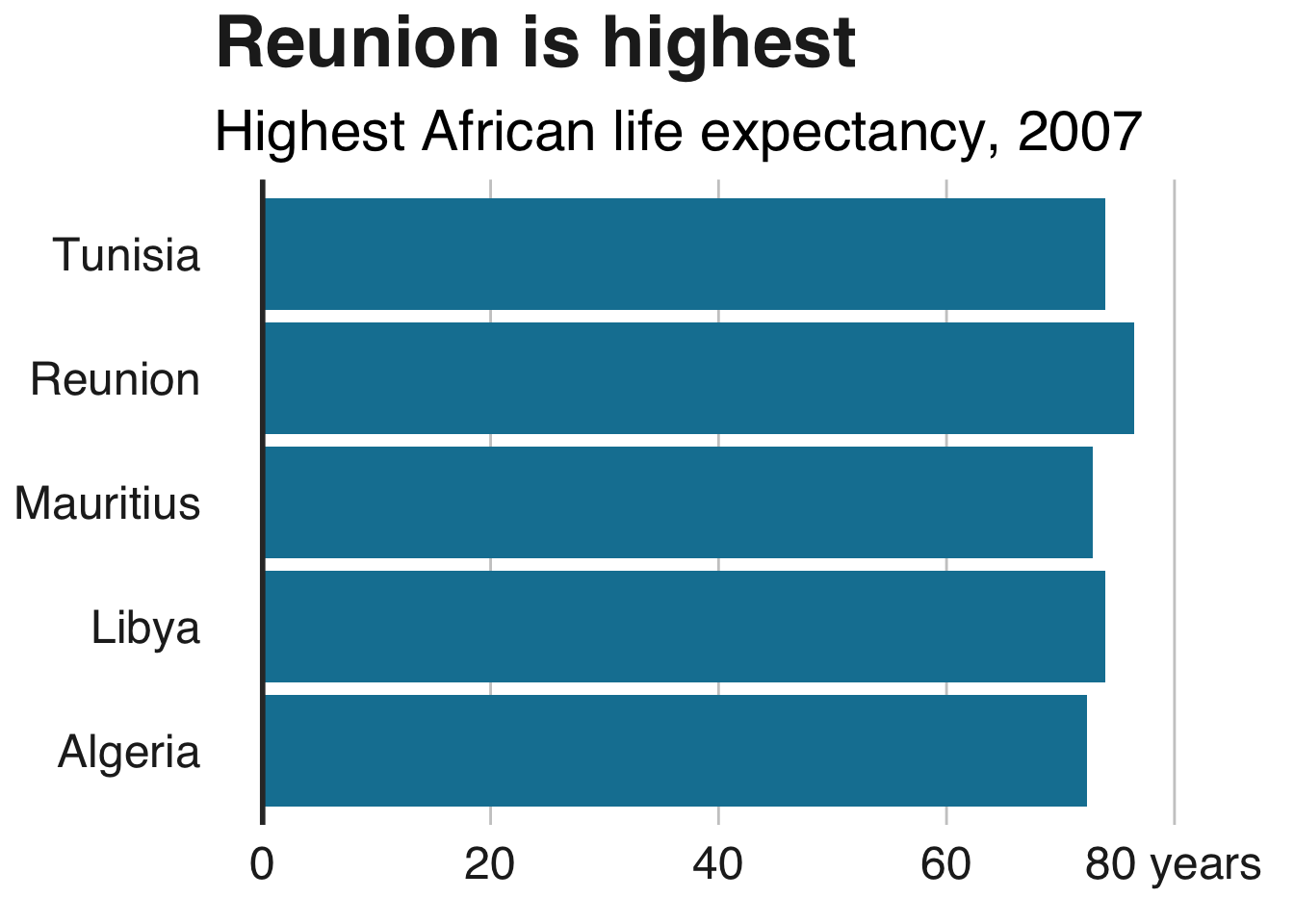
这也将指定绘图的限制以及您想要轴刻度的位置。
在轴标签上添加千位分隔符
您可以指定您希望轴文本具有带参数的千位分隔符scale_y_continuous。
有两种方法可以做到这一点,一种在基础R中,有点繁琐:
+ scale_y_continuous(labels = function(x) format(x, big.mark = ",",
                                                 scientific = FALSE))
第二种方式依赖于scales包,但更简洁:
+ scale_y_continuous(labels = scales::comma)
将百分比符号添加到轴标签
这也很容易添加一个参数scale_y_continuous:
+ scale_y_continuous(labels = function(x) paste0(x, "%"))
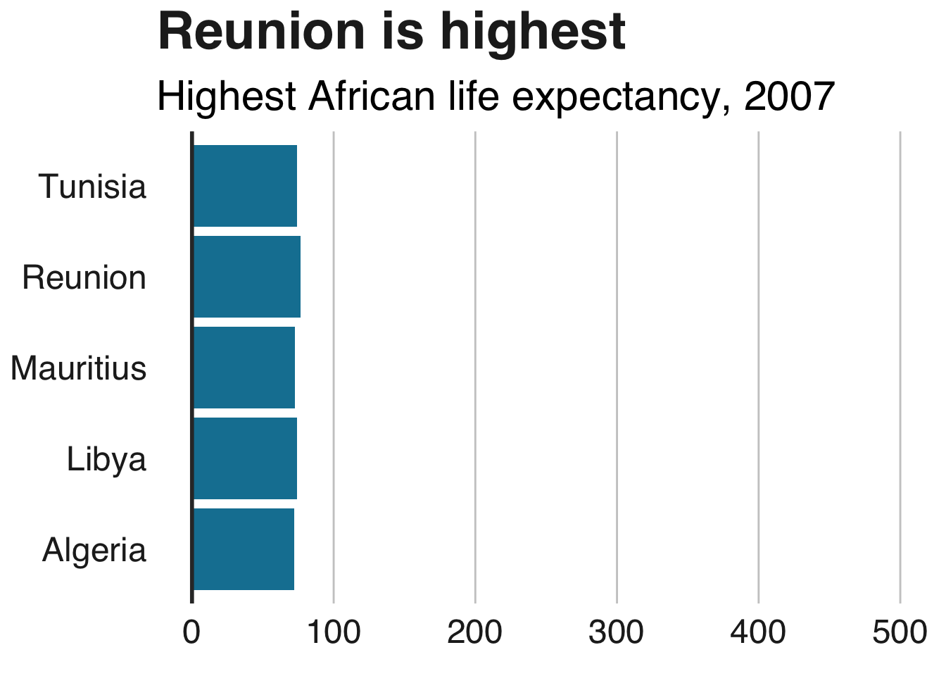
更改绘图限制
明确设置绘图限制的漫长方法scale_y_continuous如上所述。但是,如果您不需要指定中断或标签,那么使用xlim或的简写方式是ylim:
bars + ylim(c(0,500))
## Scale for 'y' is already present. Adding another scale for 'y', which
## will replace the existing scale.
添加轴标题
我们的默认主题没有轴标题,但您可能希望手动添加它们。这是通过修改来完成的theme()- 请注意,您必须在调用后执行此操作,bbc_style()否则您的更改将被覆盖:
+ theme(axis.title = element_text(size = 18))
修改轴标题
如果添加轴标题,则默认情况下它们将是数据集中的列名称。您可以将此更改为您在通话中所需的任何内容labs()。
例如,如果您希望x轴标题为“我是一个轴”而您的y轴标签为空白,则格式如下:
+ labs(x = "I'm an axis",
       y = "")
添加轴刻度
您可以通过添加加轴的刻度axis.ticks.x或axis.ticks.y您theme:
multiple_line + theme(
  axis.ticks.x = element_line(colour = "#333333"),
  axis.ticks.length =  unit(0.26, "cm"))
添加注释
添加注释
向绘图添加文本注释的最简单方法是使用geom_label:
multiple_line + geom_label(aes(x = 1980, y = 45, label = "I'm an annotation!"),
                           hjust = 0,
                           vjust = 0.5,
                           colour = "#555555",
                           fill = "white",
                           label.size = NA,
                           family="Helvetica",
                           size = 6)
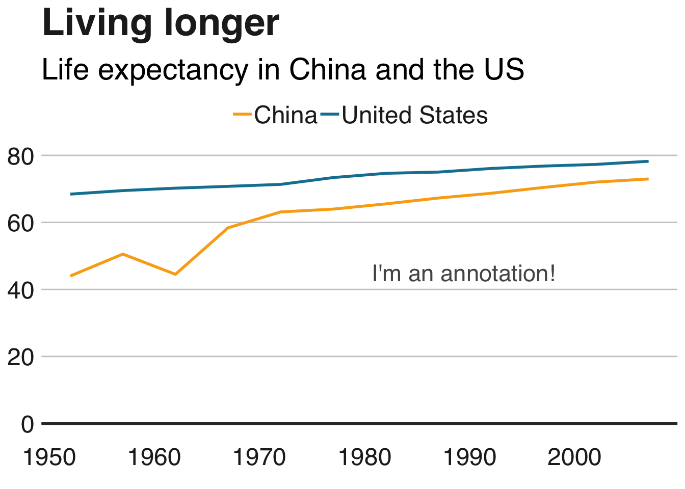
注释的确切位置将取决于x和y参数(这有点繁琐!)和文本对齐,使用hjust和vjust- 但更多的是在下面。
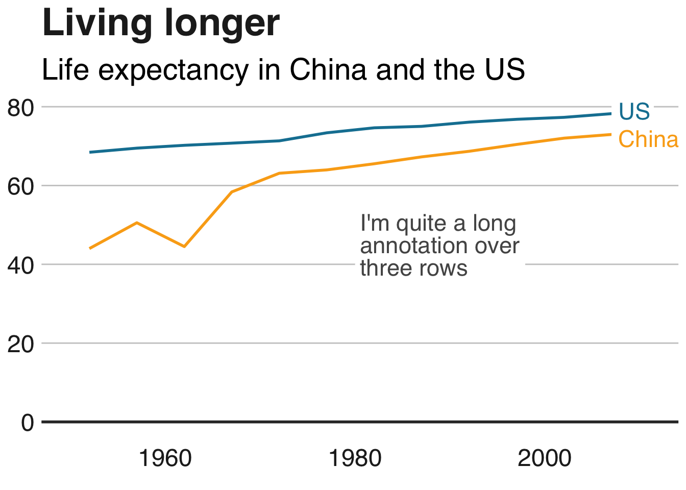
在标签中的必要位置添加换行符\n,并设置行高lineheight。
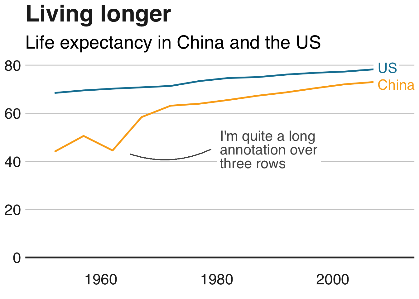
multiple_line <- multiple_line +
  geom_label(aes(x = 1980, y = 45, label = "I'm quite a long\nannotation over\nthree rows"),
             hjust = 0,
             vjust = 0.5,
             lineheight = 0.8,
             colour = "#555555",
             fill = "white",
             label.size = NA,
             family="Helvetica",
             size = 6)
让我们在那里获得直接标签!
multiple_line <- multiple_line +
  theme(legend.position = "none") +
  xlim(c(1950, 2011)) +
  geom_label(aes(x = 2007, y = 79, label = "US"),
             hjust = 0,
             vjust = 0.5,
             colour = "#1380A1",
             fill = "white",
             label.size = NA,
             family="Helvetica",
             size = 6) +
  geom_label(aes(x = 2007, y = 72, label = "China"),
             hjust = 0,
             vjust = 0.5,
             colour = "#FAAB18",
             fill = "white",
             label.size = NA,
             family="Helvetica",
             size = 6)
左对齐/右对齐文本
参数hjust和vjustdictate水平和垂直文本对齐。它们的值可以介于0和1之间,其中0表示左对齐,1表示右对齐(或垂直对齐的底部和顶部对齐)。
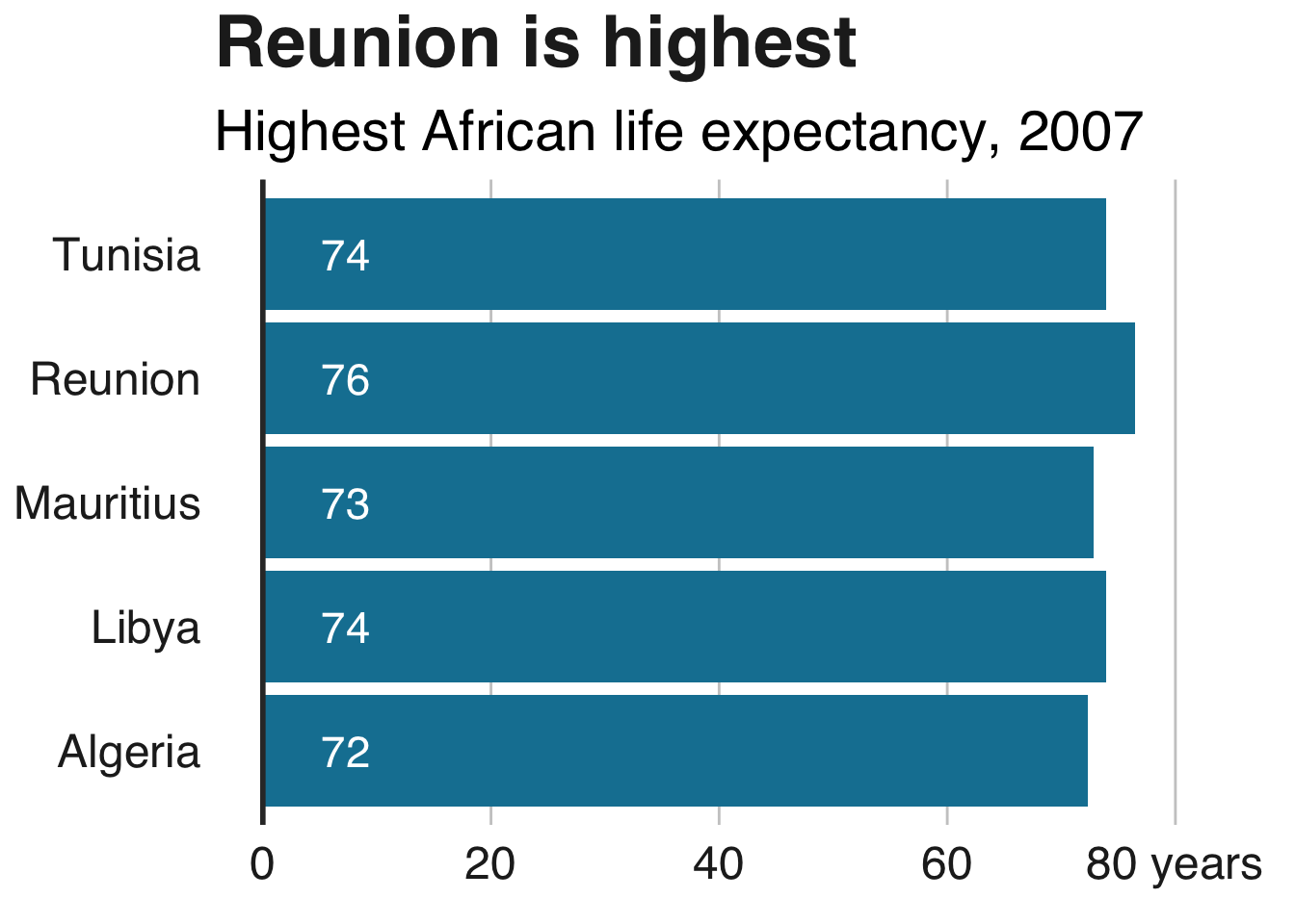
根据您的数据添加标签
上述向图表添加注释的方法允许您准确指定x和y坐标。如果我们想在特定的地方添加文本注释,这非常有用,但重复起来非常繁琐。
幸运的是,如果要为所有数据点添加标签,只需根据数据设置位置即可。
假设我们要在条形图中添加数据标签:
labelled.bars <- bars +
  geom_label(aes(x = country, y = lifeExp, label = round(lifeExp, 0)),
             hjust = 1,
             vjust = 0.5,
             colour = "white",
             fill = NA,
             label.size = NA,
             family="Helvetica",
             size = 6)

labelled.bars
上面的代码会自动为每个大陆添加一个文本标签,而不必添加geom_label五个单独的时间。
(如果你对为什么我们把它设置x为大陆和y预期寿命感到困惑,当图表看起来反过来绘制它们时,这是因为我们已经使用了coord_flip()你的情节坐标,你可以在这里阅读更多信息。)
将左对齐标签添加到条形图
如果您更愿意为条形添加左对齐标签,只需x根据数据设置参数,但y直接使用数值指定参数。
确切的值y取决于您的数据范围。
labelled.bars.v2 <- bars +
  geom_label(aes(x = country,
                 y = 4,
                 label = round(lifeExp, 0)),
             hjust = 0,
             vjust = 0.5,
             colour = "white",
             fill = NA,
             label.size = NA,
             family="Helvetica",
             size = 6)

labelled.bars.v2
添加一行
添加一行geom_segment:
multiple_line + geom_segment(aes(x = 1979, y = 45, xend = 1965, yend = 43),
                             colour = "#555555",
                             size=0.5)

该size参数指定了线的厚度。
添加曲线
对于曲线,请使用geom_curve而不是geom_segment:
multiple_line + geom_curve(aes(x = 1979, y = 45, xend = 1965, yend = 43),
                           colour = "#555555",
                           curvature = -0.2,
                           size=0.5)
所述curvature参数设置曲线的量:0是一条直线,负值给左手曲线而正值给右手曲线。
添加箭头
将一条线转换为箭头非常简单:只需将arrow参数添加到您的geom_segment或geom_curve:
multiple_line + geom_curve(aes(x = 1979, y = 45, xend = 1965, yend = 43),
                             colour = "#555555",
                             size=0.5,
                             curvature = -0.2,
                             arrow = arrow(length = unit(0.03, "npc")))

unit设置箭头大小的第一个参数。
在整个图中添加一条线
在整个绘图中添加直线的最简单方法是geom_vline(),对于垂直线,或geom_hline()对于水平线。
可选的附加参数允许您指定行的大小,颜色和类型(默认选项是实心的)。
multiple_line + geom_hline(yintercept = 10, size = 1, colour = "red", linetype = "dashed")
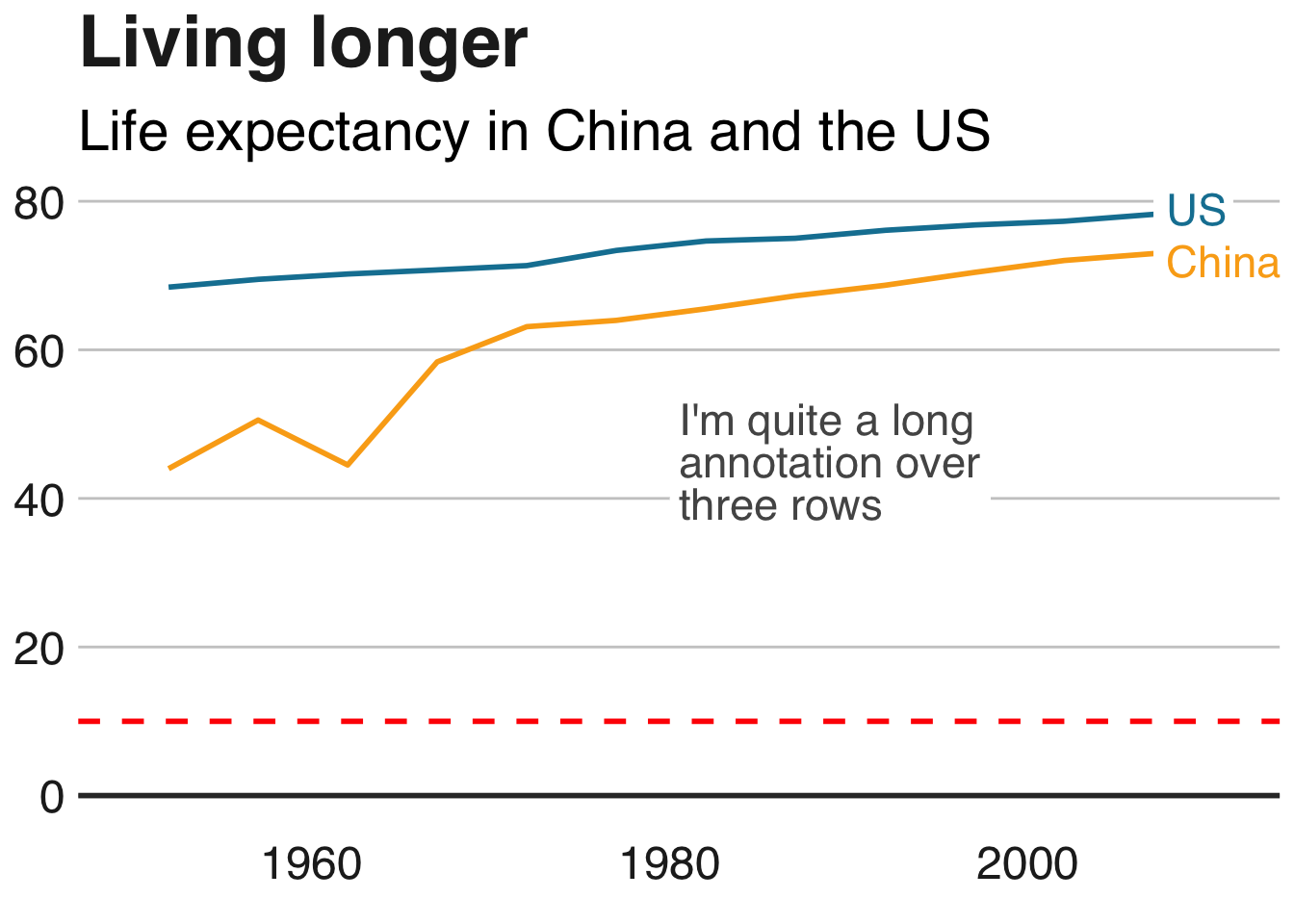
在这个例子中,这条线显然没有增加多少,但是如果你想要突出显示某些东西,例如阈值水平或平均值,这很有用。
它也特别有用,因为我们的设计风格 - 正如您在本页图表中已经注意到的那样 - 是为我们的图表添加垂直或水平基线。这是要使用的代码:
+ geom_hline(yintercept = 0, size = 1, colour = "#333333")
使用小倍数
使用ggplot可以很容易地创建小的多个图表:它被称为分面。
面
如果您想要通过某个变量进行可视化分割的数据,则需要使用facet_wrap或facet_grid。
将要除以的变量添加到此代码行:facet_wrap( ~ variable)。
facet wrap的另一个参数ncol允许您指定列数:
#Prepare data
facet <- gapminder %>%
  filter(continent != "Americas") %>%
  group_by(continent, year) %>%
  summarise(pop = sum(as.numeric(pop)))

#Make plot
facet_plot <- ggplot() +
  geom_area(data = facet, aes(x = year, y = pop, fill = continent)) +
  scale_fill_manual(values = c("#FAAB18", "#1380A1","#990000", "#588300")) +
  facet_wrap( ~ continent, ncol = 5) +
  scale_y_continuous(breaks = c(0, 2000000000, 4000000000),
                     labels = c(0, "2bn", "4bn")) +
  bbc_style() +
  geom_hline(yintercept = 0, size = 1, colour = "#333333") +
  theme(legend.position = "none",
        axis.text.x = element_blank()) +
  labs(title = "Asia's rapid growth",
       subtitle = "Population growth by continent, 1952-2007")

自由秤
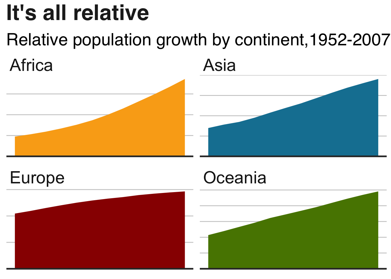
你可能已经在上面的图表中注意到,人口相对较少的大洋洲已完全消失。
默认情况下,构面使用小倍数上的固定轴刻度。最好在小倍数上使用相同的y轴刻度,以避免误导,但有时您可能需要为每个倍数单独设置这些,我们可以通过添加参数来完成scales = "free"。
如果您只想释放一个轴的刻度,请将参数设置为free_x或free_y。
#Make plot
facet_plot_free <- ggplot() +
  geom_area(data = facet, aes(x = year, y = pop, fill = continent)) +
  facet_wrap(~ continent, scales = "free") +
  bbc_style() +
  scale_fill_manual(values = c("#FAAB18", "#1380A1","#990000", "#588300")) +
  geom_hline(yintercept = 0, size = 1, colour = "#333333") +
  theme(legend.position = "none",
        axis.text.x = element_blank(),
        axis.text.y = element_blank()) +
  labs(title = "It's all relative",
       subtitle = "Relative population growth by continent,1952-2007")
完全做别的事
增加或减少保证金
你可以改变你的情节的几乎任何元素 - 标题,字幕,图例 - 或情节本身的边距。
您通常不需要更改主题的默认边距,但如果这样做,则语法为theme(ELEMENT=element_text(margin=margin(0, 5, 10, 0)))。
数字分别指定了上边距,右边距,下边距和左边距 - 但您也可以直接指定要更改的边距。例如,让我们尝试为副标题提供一个超大的底部边距:
bars + theme(plot.subtitle=element_text(margin=margin(b=75)))
嗯…也许不是。
导出绘图和x轴边距
当您生成超出默认高度的绘图时,您需要考虑x轴边距大小bbplot,即450px。例如,如果您要创建一个包含大量条形图的条形图,并希望确保每个条形图和标签之间有一些喘息空间,则可能就是这种情况。如果您确保将边距保留为具有更高高度的图的边距,那么您可以在轴和标签之间获得更大的间隙。
以下是我们在条形图的边距和高度(适用于coord_flip)时的工作指南:
| size | t | b |
|---|---|---|
| 550px | 5 | 10 |
| 650px | 7 | 10 |
| 750px | 10 | 10 |
| 850px | 14 | 10 |
因此,您需要做的是将此代码添加到图表中,例如,您希望绘图的高度为650px而不是450px。
bar_chart_tall <- bars + theme(axis.text.x = element_text(margin=margin(t = 7, b = 10)))
bar_chart_tall
虽然它的可能性要小得多,但是如果您确实想要为折线图执行等效操作并将其导出到大于默认高度,则需要执行相同的操作,但是根据上表将t的值更改为负值。
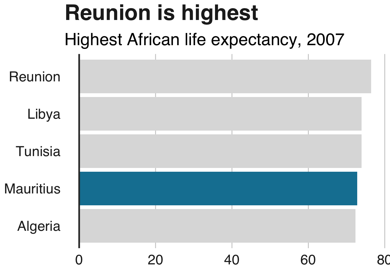
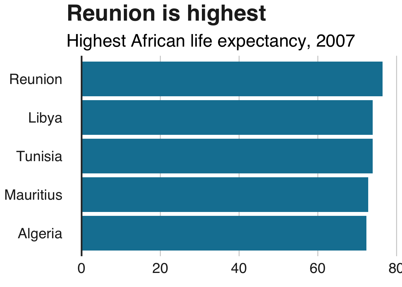
按大小重新排序栏
默认情况下,R会按字母顺序显示您的数据,但按大小排列它,而不是很简单:只是包装reorder()围绕x或y要重新排列变量,并指定要通过重新安排它的变数。
例如x = reorder(country, pop)。升序是默认值,但您可以通过desc()绕过您订购的变量来将其更改为降序:
bars <- ggplot(bar_df, aes(x = reorder(country, lifeExp), y = lifeExp)) +
  geom_bar(stat="identity", position="identity", fill="#1380A1") +
  geom_hline(yintercept = 0, size = 1, colour="#333333") +
  bbc_style() +
  coord_flip() +
  labs(title="Reunion is highest",
       subtitle = "Highest African life expectancy, 2007") +
  theme(panel.grid.major.x = element_line(color="#cbcbcb"),
        panel.grid.major.y=element_blank())
手动重新排序栏
有时,您需要以不按字母顺序排列或按大小重新排序的方式对数据进行排序。
要正确订购,您需要在制作绘图之前设置数据的因子水平。
指定要在levels参数中绘制类别的顺序:
dataset$column <- factor(dataset$column, levels = c("18-24","25-64","65+"))
您还可以使用它来重新排序堆积条形图的堆栈。
彩条有条不紊
您可以有条件地设置美学值,如填充,alpha,大小ifelse()。
语法是fill=ifelse(logical_condition, fill_if_true, fill_if_false)。
ggplot(bar_df,
       aes(x = reorder(country, lifeExp), y = lifeExp)) +
  geom_bar(stat="identity", position="identity", fill=ifelse(bar_df$country == "Mauritius", "#1380A1", "#dddddd")) +
  geom_hline(yintercept = 0, size = 1, colour="#333333") +
  bbc_style() +
  coord_flip() +
  labs(title="Reunion is highest",
       subtitle = "Highest African life expectancy, 2007") +
  theme(panel.grid.major.x = element_line(color="#cbcbcb"),
        panel.grid.major.y=element_blank())